World Archery
Scope
World Archery runs all archery competition activities from the World Series to the Olympic qualifiers. The scope of this project was a redesign of the logo. I decided to design a sleeker and more modern logo for the federation to reflect the sophistication of the organization and its partner companies.
Credits
Stock Images: Unsplash, World Archery
Awards
Problem:
The World Archery Federation needed a brand refresh to align with its brand statement and to reposition itself as a sophisticated sports federation. The Federation needed a brand similar to that of the other Olympic sports programs.
Outcome:
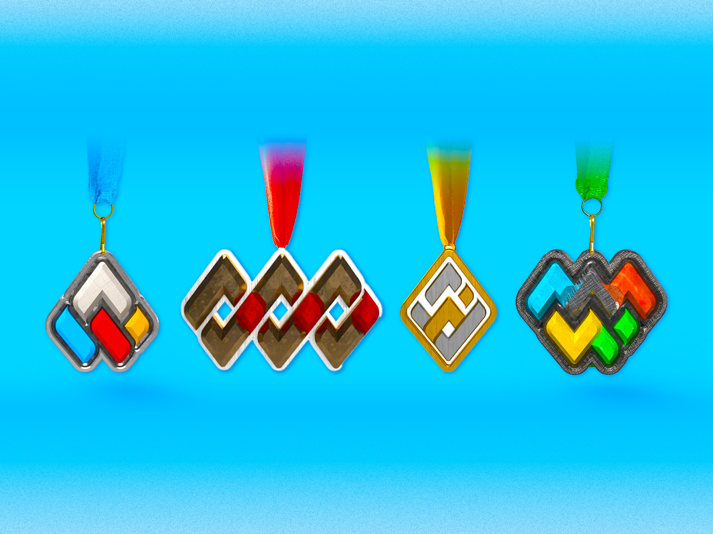
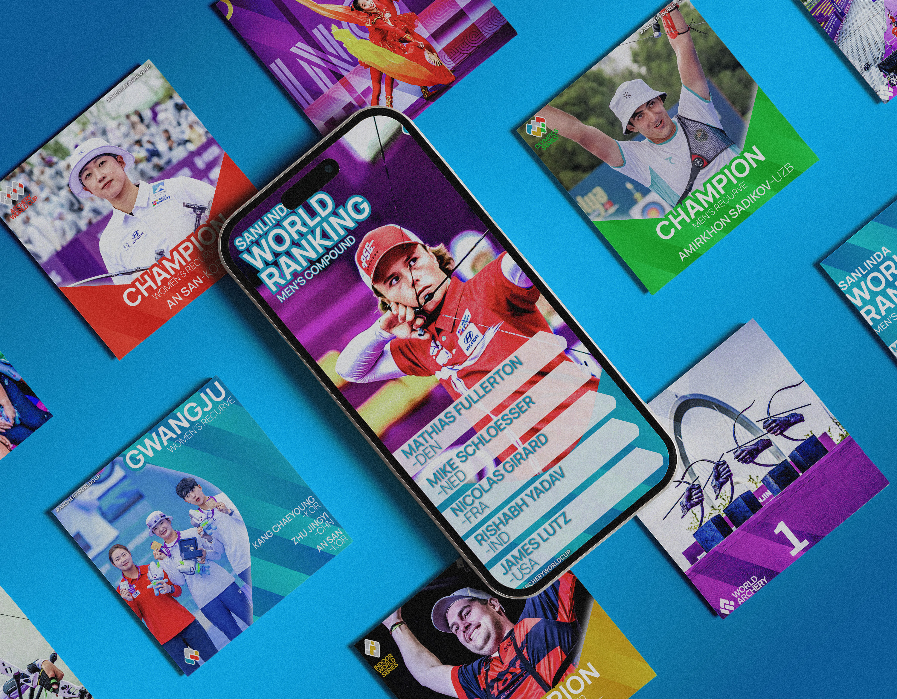
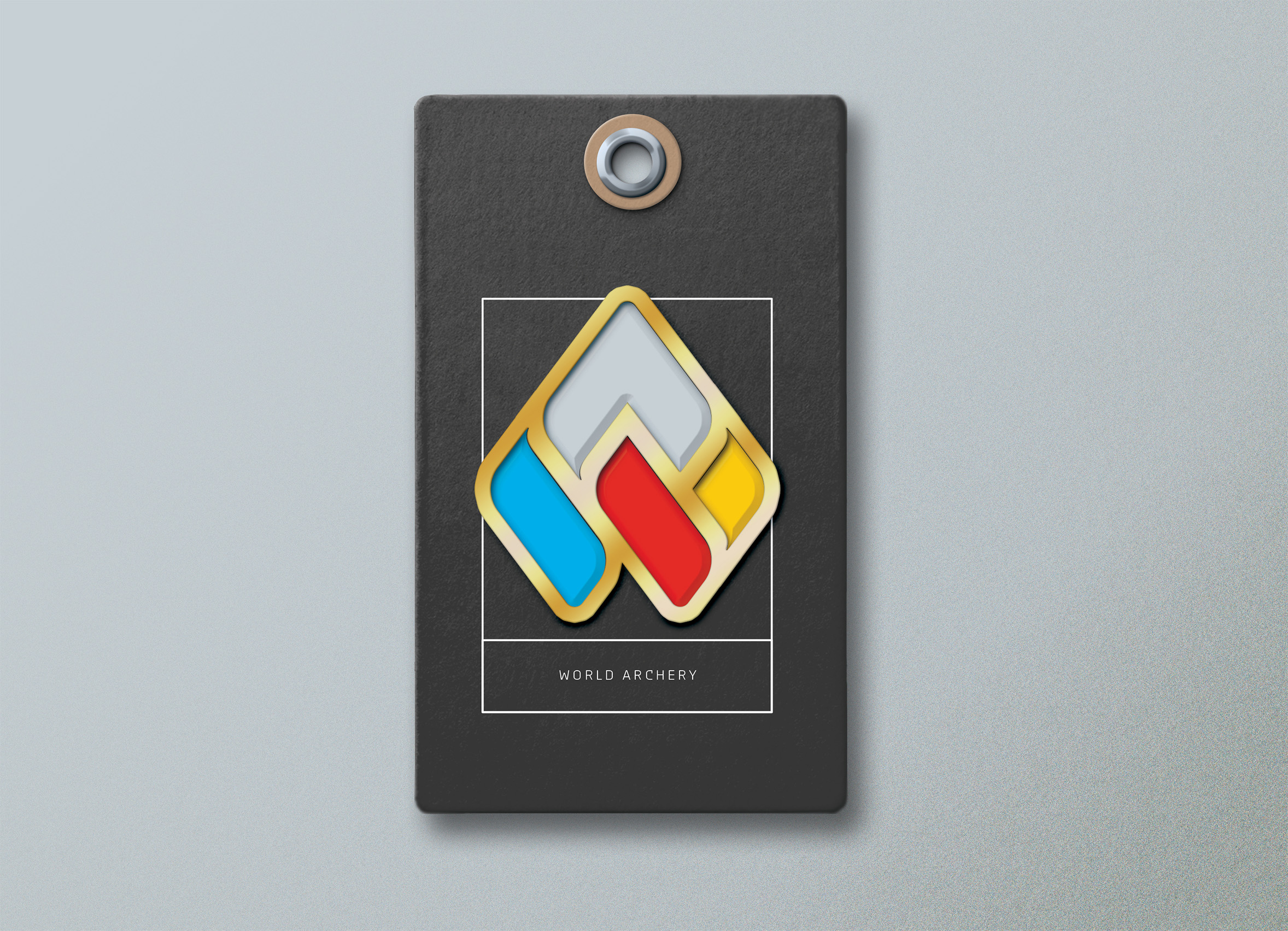
This new logo simplifies the World Archery Federation’s name to just “World Archery” to make it less wordy while still aligning with other sports federations. The color was also reduced to make the brand look more cohesive. Each color represents a column in the brand’s values, which pairs well with its split discipline. The logo mark has the initials A and W, which resemble an arrowhead. At the same time, the end of the W subtilly resembles a pulled bow.
Logo System:
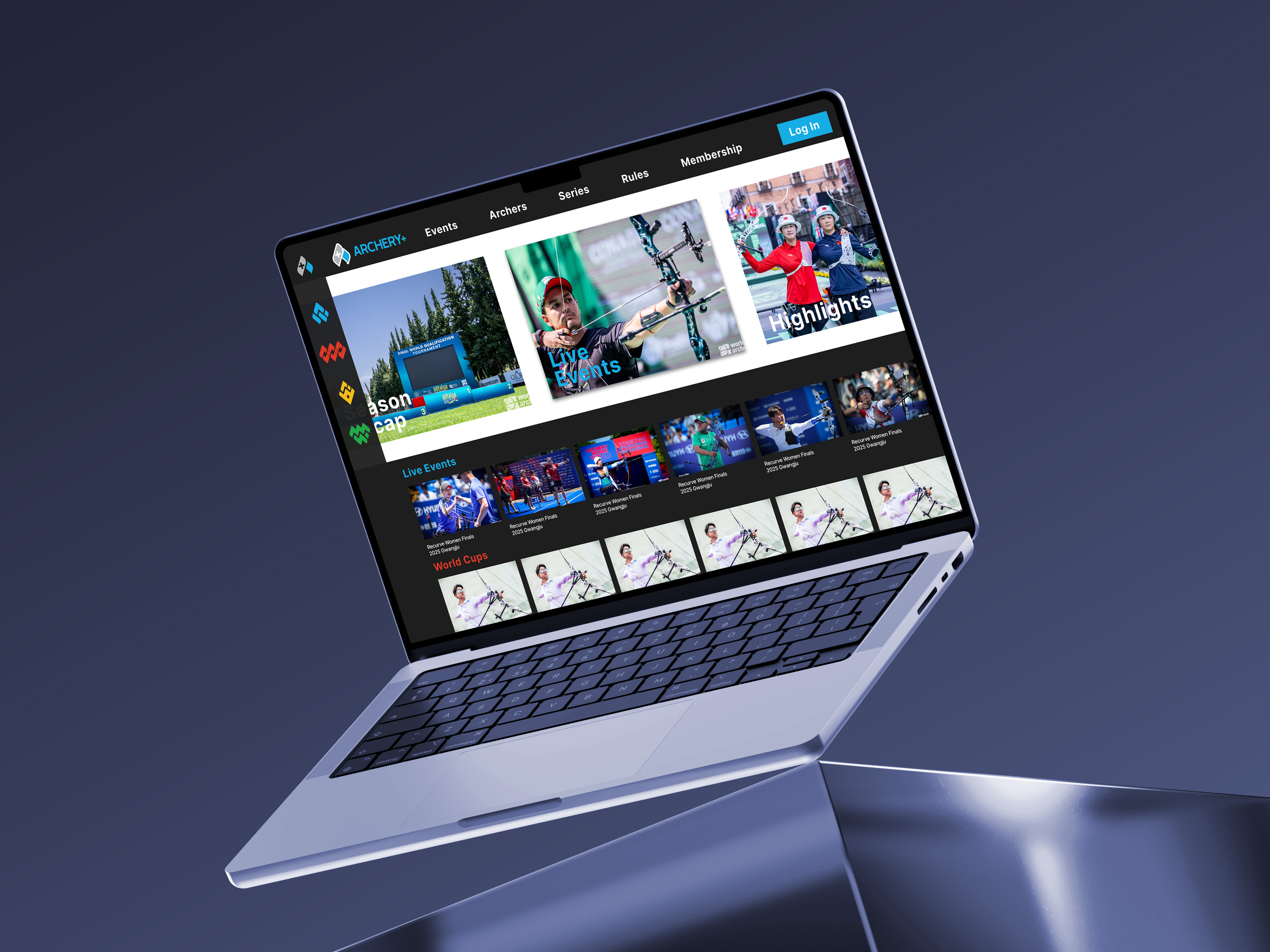
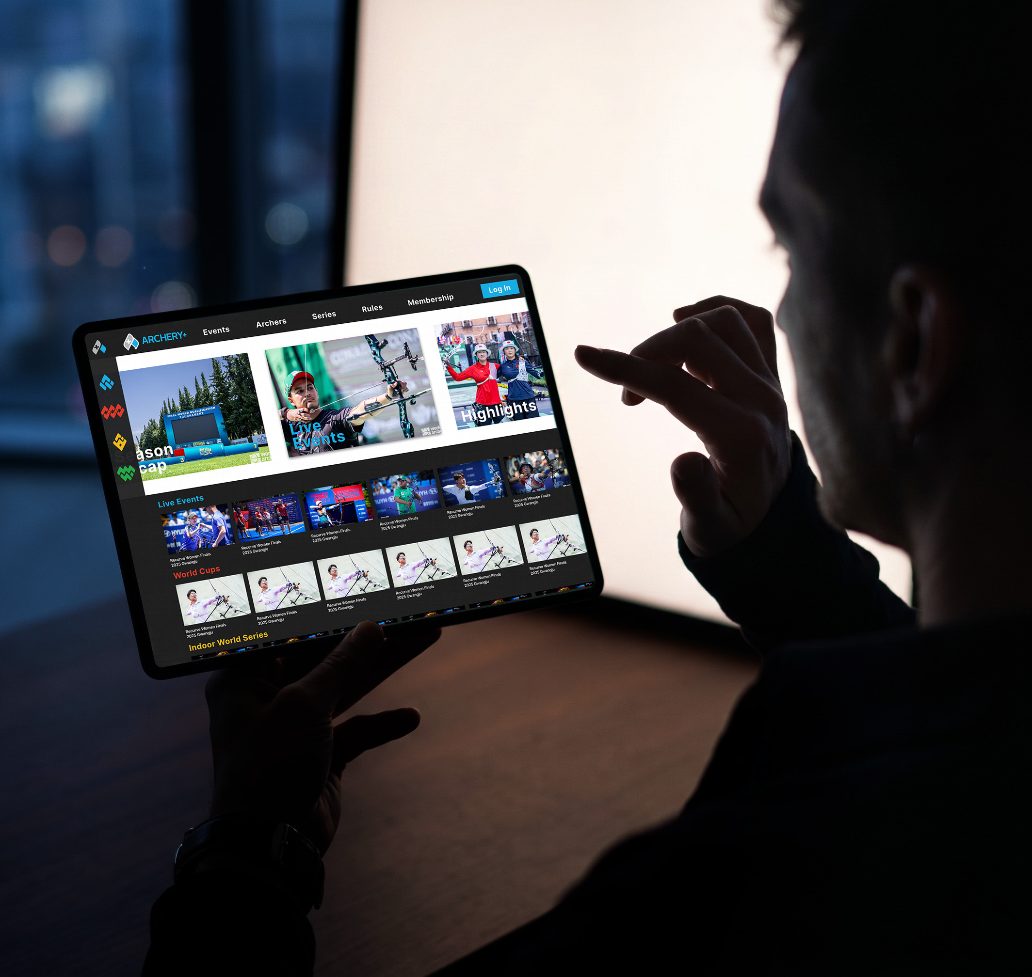
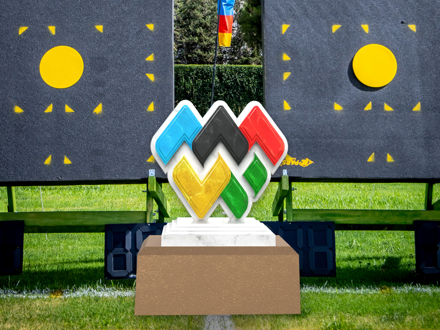
To accompany the main logo, the sub-logo represents each of the special programs World Archery runs, including the World Cup series, indoor World Series, and the Olympic Qualifiers Series. An Archery Plus logo was also created for their streaming services.