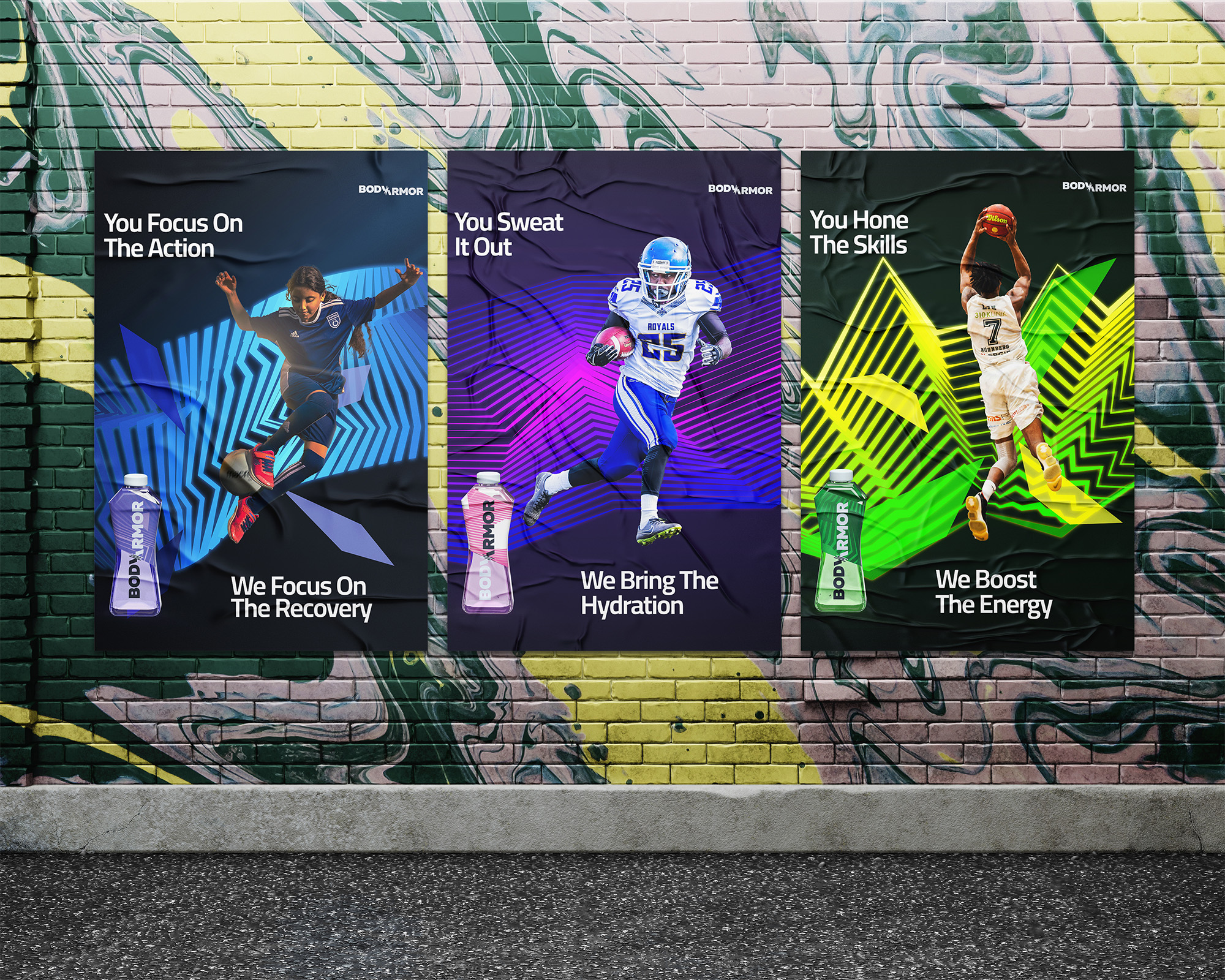
Body Armor
Scope
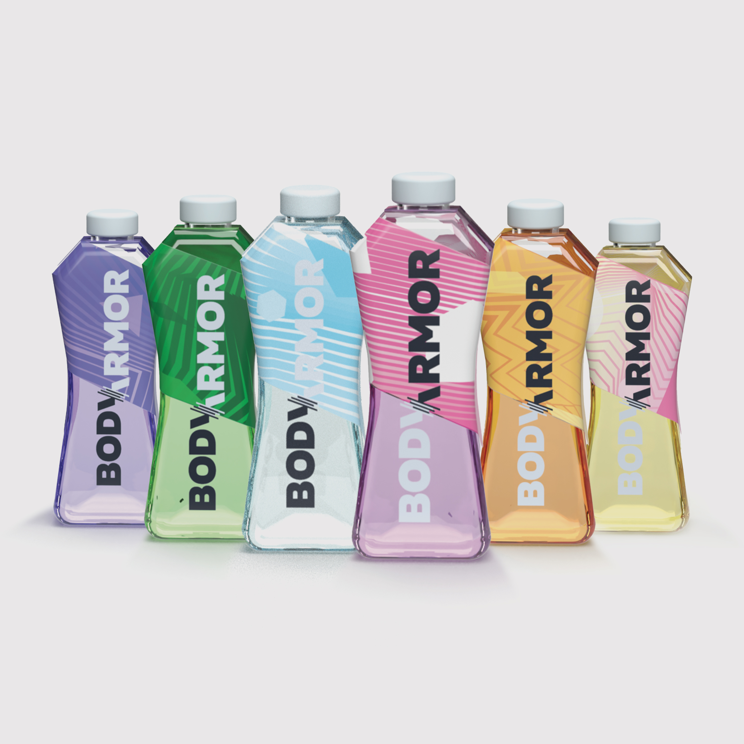
Body Armor is a drink that provides nutrition and hydration to everyday athletes. The scope of this project was a redesign of the logo and packaging. I decided to design a more versatile logo for the brand so that it could work among their line of products. In addition, I updated the packaging to reflect the transparency of the drink's ingredients. This shows that the brand has nothing to hide regarding their products.
Credits
Freepiks
Problem
Body Armor needed a major brand refresh as well as a packaging refresh
Outcome
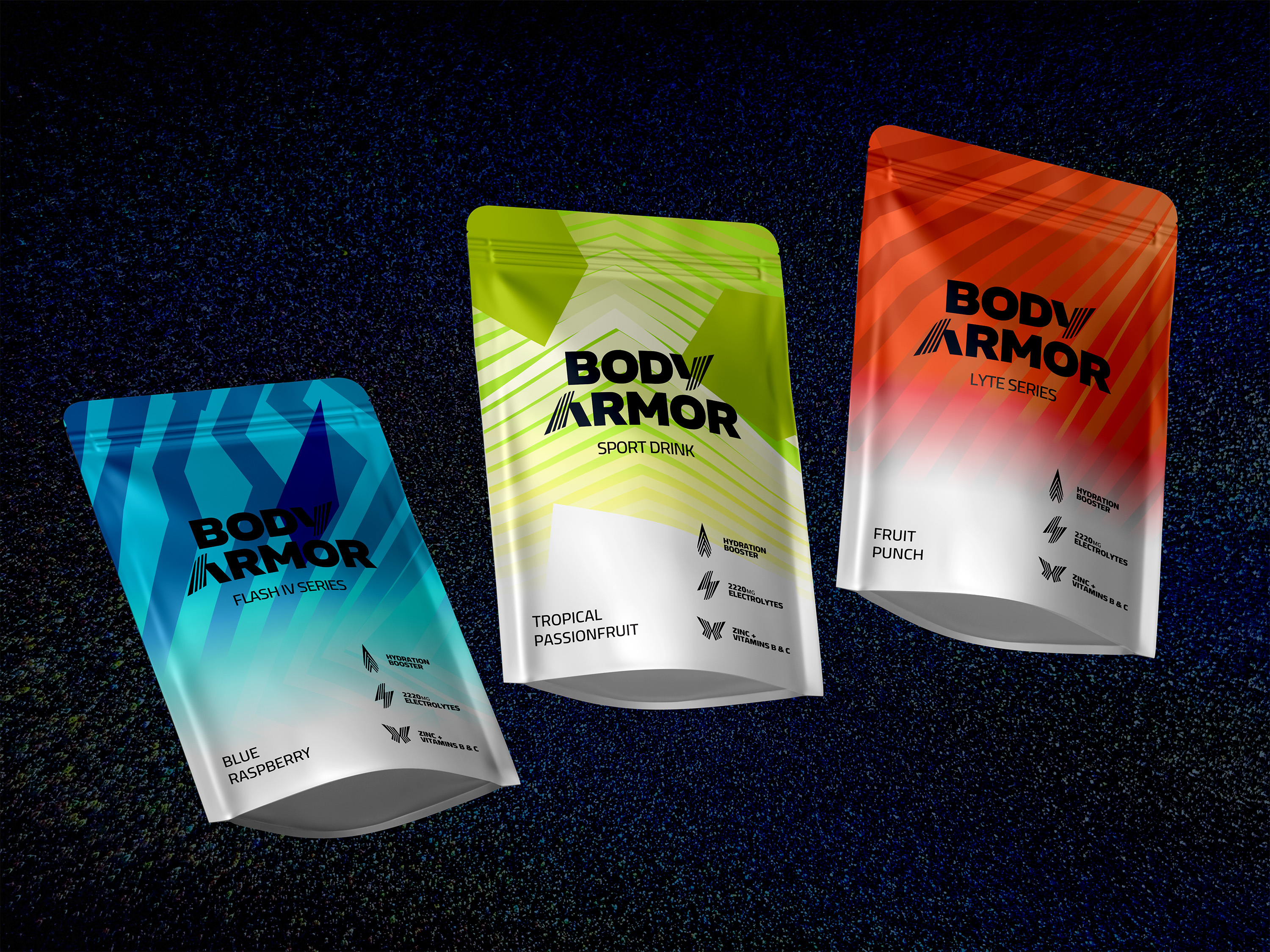
Logo: To accurately symbolize the impact of Body Armor, the final product features a simple logotype paired with a bold sans-serif font. The Y and R resemble the muscle strands and muscle tissue that recovery using “Body Armor” can provide.
Graphic Assets:
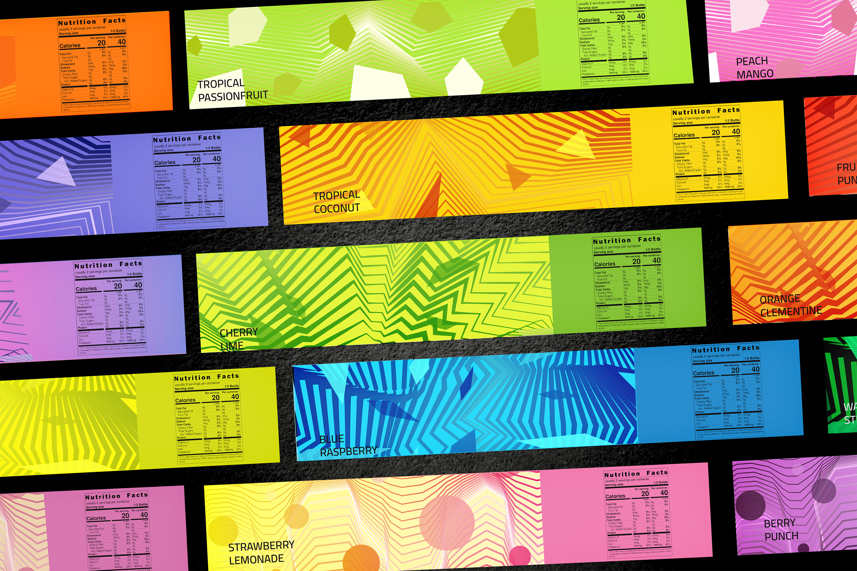
There are expressive graphics for each of the 7 drink series Body Armor offers. The patterns help to distinguish the drinks from one another.
Packaging:
The new bottle shape is more ergonomic and clearly distinguishes each drink from the other.